The University of Nevada, Reno revealed new institutional and athletic logos on Oct. 20 as part of a university-wide rebrand. In honor of the rebrand, I decided to rank current Nevada Athletics logos, including vintage logos and the brand-new logo.
8. Pack of Vintage Logos
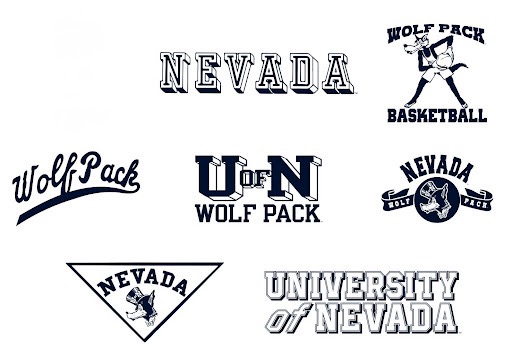
I’m grouping seven of Nevada’s eight vintage logos together simply because the program doesn’t use these logos anymore, so it’s hard to rank them individually. They’re all fun and goofy logos, especially the wolf handling the basketball.
7. Nevada Baseball and Softball “Nevada” Script
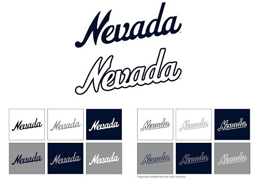
I don’t necessarily dislike this logo, it’s just one-dimensional. Only the Nevada baseball team and softball team are allowed to use it, so there’s not much creativity beyond that. The script was introduced in 2023, and it is currently the main jersey logo for baseball and softball.
6. Nevada Athletics / Wolf Pack Block Text
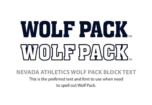
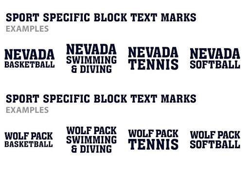
These two logos have been used throughout Nevada Athletics since 2023. Almost every sport uses them for team-issued gear, as well as for merchandise available to students and fans. I have it at sixth because the wordmarks are easily recognizable across campus, but it’s still a standard font and not too memorable.
5. New Sport Wolf
When the University revealed its new institutional and athletic logos at the Fieldhouse ribbon cutting ceremony, I heard a mix of cheers and groans from the large crowd of donors, students and faculty members. They were mostly cheers of support, but the positivity wasn’t unanimous.
When I first saw the new “Sport Wolf,” I immediately disliked it. But after looking at it a bit longer, I realized it wasn’t too bad of a logo. The wolf looks slimmer and more agile. I like the hidden “N” in the wolf’s ear. The larger “Nevada” wordmark gives the logo more breathing room, as opposed to the old “Sport Wolf,” which in contrast looked squeezed together and bunched-up.
It’s not higher than the next three logos simply because we haven’t seen it on any uniforms, but I have high hopes for it. The new logo first appeared on the Nevada Football helmets on Saturday, Oct. 24, when Nevada defeated San Jose State at home.
4. Nevada Baseball and Softball “N” Logo
This logo was first introduced in 1980 as one of Nevada’s first alternate logos. It’s only been altered twice since it was revealed, with just the colors being slightly tweaked. I really like the simplicity of it. It’s a unique font, and yet it’s simple enough to understand. Although it’s only used for the baseball and softball teams, I’ve seen this logo a lot around campus, with people wearing it on hats, shirts and hoodies.
3. Pack Script
The Pack script is awesome. It’s been around Nevada since 1985, with only a few color tweaks along the way. I like the simplicity of it, and it can be used on anything Nevada-related. Like the baseball and softball “N,” the Pack script logo is everywhere on campus. It’s a fan-favorite and a favorite of mine.
2. Old Sport Wolf
From 2008 to October 2026, the “Sport Wolf” has looked like this: clean, mean and looking to take care of business. Some buildings and facilities on campus include either version of this logo. It’s on probably 80% of all Nevada merchandise, and it’s the most recognizable logo. As a current junior at the University, I think of this logo when I think of the University and Nevada Athletics.
1. Top Hat Wolf
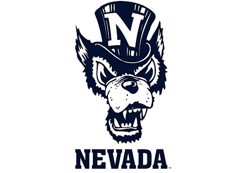
The original Top Hat Wolf was created in the early 1920s, and had “U of N” on the wolf’s top hat. In 2008, the University updated the logo to replace “U of N” with just “N.”
This is the greatest logo Nevada has ever had. The wolf’s expression, the two-tone color scheme, and the goofy top hat make this logo memorable and distinct. I wish Nevada used it more, even if it was only used as an alternate logo.